Count Is Not Risk: Security Metrics, KPIs and KRIs That Actually Matter
Browse all 27 field guides
- Alert to Conclusion: Investigating Without Tunnel Vision
- From Header to Host: Investigating Phishing in the SOC
- How to Think Like a SOC Analyst in an Interview
- Identity Attacks for SOC Analysts: Sessions, Tokens, MFA and Account Compromise
- The IP Isn't the Attacker: A SOC Analyst's Guide to NAT, VPNs and Proxies
- PowerShell Is Not the Alert: Investigating Living-off-the-Land Activity
- Ransomware Before the Ransomware: What the SOC Should See Before Encryption Starts
- SPF, DKIM and DMARC: What They Actually Prove (and What They Don't)
- Threat Hunting for SOC Analysts: Turning a Suspicion Into a Searchable Hypothesis
- Windows Event Logs for SOC Analysts: What an Event ID Actually Proves
- One Alert Is Not the Incident: Scoping Security Incidents in the SOC
- Beyond the Alert: CIS Critical Security Controls v8.1 for SOC Analysts
- Six Functions, Not Six Steps: NIST CSF 2.0 for SOC Analysts
- Check the Scope First: ISO 27001 for SOC Analysts
- Search It, Don't Memorise It: NZISM for Security Practitioners
- Same Problem, Four Lenses: CIS vs NIST vs ISO 27001 vs NZISM
- A Claim Is Not Evidence: Security Assurance for SOC Analysts
- Inherent Risk Comes First: Supplier Security Assurance for Analysts
- Present Is Not Effective: How to Test Security Controls
- A Clean Opinion Is Not Zero Risk: How to Read a SOC 2 Report
- Count Is Not Risk: Security Metrics, KPIs and KRIs That Actually Matter (this article)
- Read the Scope Before the Findings: How to Review a Penetration Test Report
- Not the Assessment Itself: How to Design a Supplier Security Questionnaire
- Which Part? Cloud and SaaS Security Assurance
- Lead With the Decision: Executive Security Risk Reporting
- Related Is Not Identical: Framework and Control Mapping Without the Spreadsheet Monster
- CIS, NIST, ISO 27001 and NZISM: The Interview Guide for Security Practitioners
A SOC dashboard, mid-month: 12,486 alerts this month. 9,842 threats blocked. 1,847 phishing emails detected. 312 vulnerabilities found. 97.8% endpoint coverage. Everything's green.
Now the part the dashboard doesn't show. The missing 2.2% of endpoint coverage includes five domain controllers. Twenty-eight critical internet-facing vulnerabilities are overdue for remediation. Seventeen privileged accounts have no MFA. Four critical log sources stopped sending events weeks ago. One backup restore test failed and nobody followed up. Eight high-risk supplier findings sit overdue.
Nothing on that original dashboard was technically false. It just measured the wrong things, and measured them in a way that made "everything's fine" the easiest possible reading. That gap, between a number being accurate and a number being useful, is what this article is about.
Remember this
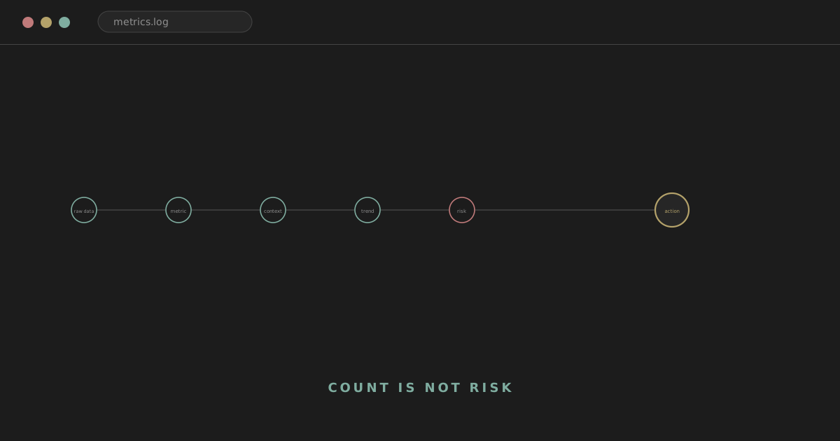
Don't start with the data. Start with the question: question, decision, what we'd need to know to make it, metric, data, context, trend or threshold, action. A metric that doesn't trace back to a real decision is usually just reporting noise wearing a number.
This is the second article in the specialist series following the core framework and assurance series, applying the same evidence-based discipline, this time to how you actually measure and report on security.
analyst@thefish.nz:~$ cat contents.txt
Sections
What makes a metric useful
A useful metric answers a real question. "Are critical systems protected by EDR" needs the percentage and the count of critical systems with genuinely healthy coverage, not organisation-wide coverage. "Are we reducing vulnerability exposure" needs the age and distribution of exploitable vulnerabilities on critical assets, not a total vulnerability count. "Can we detect identity compromise" needs authentication telemetry coverage for the identity platforms that actually matter. "Are findings actually being resolved" needs the age and overdue rate of material findings, not how many assessments were performed.
Work backwards from a decision. Decision: do we need to invest in identity improvements? What would actually help answer that: privileged MFA coverage, legacy authentication still in use, stale privileged accounts, confirmed account-compromise incidents, risky sign-in trends, access-review exceptions. That's a considerably stronger starting point than "how many identity metrics can we fit on a dashboard."
Metric, KPI, KRI
These terms get used inconsistently across organisations and even across standards, so treat what follows as a practical teaching model rather than a universal definition. A metric is any useful measurement. A KPI, Key Performance Indicator, helps indicate how well a process, control or function is performing, roughly: are we doing what we intended to do? A KRI, Key Risk Indicator, helps indicate whether risk exposure is increasing, decreasing, or approaching an unacceptable level, roughly: is our exposure moving toward a state we shouldn't accept?
CONTROL PERFORMANCE → KPI: "Are we doing what we intended?"
RISK EXPOSURE → KRI: "Is exposure moving toward unacceptable?"
Whether your own organisation formally distinguishes these, or just calls everything "a metric," matters less than understanding which question a given number is actually trying to answer.
Activity vs outcome
Activity metrics describe what was done: 5,000 alerts investigated, four vulnerability scans completed, 600 users trained, 30 supplier assessments performed. Outcome metrics describe what actually changed: mean time to contain high-severity incidents fell, critical exploitable exposure decreased, phishing compromise rate dropped, overdue supplier risks reduced, control coverage improved. Activity metrics aren't worthless, they can demonstrate a process is actually running, but more activity doesn't automatically mean better security, and a dashboard full of activity numbers can look busy while telling you nothing about whether risk is actually moving in the right direction.
A related distinction: output ("80 access reviews completed") versus outcome ("17 inappropriate privileged assignments removed," or better still, "material access exceptions have fallen over the last three quarters"). Output shows the process ran. Outcome shows it accomplished something.
Leading vs lagging
Leading indicators offer early warning of growing exposure: a rising count of overdue vulnerabilities, falling EDR coverage, a growing number of expired exceptions, an unexplained rise in privileged accounts, declining log-source health. Lagging indicators reflect something that's already happened: confirmed incidents, account compromises, ransomware events, breaches, major outages. Neither is inherently better than the other; useful measurement generally needs both, leading indicators to act before something goes wrong, lagging indicators to confirm whether the whole system is actually working.
Count is not risk
Organisation A has 10,000 open vulnerabilities. Organisation B has 500. Which has lower risk? Genuinely unknown from those two numbers alone. A might be mostly low-severity workstation findings that barely matter. B might include twenty-five internet-facing, actively exploited critical vulnerabilities. Raw counts need context before they mean anything at all.
Denominators matter just as much. "200 devices lack EDR" sounds concerning; against a fleet of 210 it's a crisis, against a fleet of 80,000 it's a rounding error, and either framing on its own hides the other. Percentages solve one problem and immediately create another: "99.8% EDR coverage" sounds excellent, and the missing 0.2% can still be exactly the handful of domain controllers that matter most. Show percentage, count, and risk context together, or the number will mislead someone.
Averages hide the same way. "Average patch age: 12 days" looks fine right up until you learn three critical internet-facing vulnerabilities have sat unpatched for 120 days each, quietly averaged out by a much larger pile of trivial, low-risk findings. A mean time to respond of two hours can be hiding one catastrophic six-hour delay sitting alongside a string of five-minute responses. Medians and percentiles tell a richer story with barely more effort: an MTTR average of two hours might carry a median of 25 minutes and a 95th percentile of nine hours, three numbers that together say considerably more than one average ever could, without needing to turn the article into a statistics lecture to get there.
Trends and thresholds
A single value, "94% MFA coverage," tells you almost nothing on its own. A trend, January 88%, March 92%, June 94%, September 91%, tells you something is moving, and specifically that it started slipping again after June, worth asking why before it slips further. Always ask whether a number is getting better, worse, or holding steady, and then ask why, not just what the current value happens to be.
A red line on a dashboard means nothing unless crossing it triggers something real. If EDR coverage on critical systems drops below 98%, what actually happens next: does it raise an alert, trigger escalation, generate a ticket, land with a named owner, prompt an investigation? A threshold with no defined action attached is decoration, not measurement.
Ownership and data quality
Every metric worth keeping on a dashboard should have a clear definition, a named owner, a known data source, a defined reporting frequency, a target or threshold where one genuinely applies, a specific audience, and an expected action if it breaches that threshold. Without these, dashboards accumulate into orphaned reporting nobody's actually accountable for.
Data quality deserves real scrutiny. "98% of servers have EDR" sourced from the CMDB is only as good as the CMDB itself. Worth asking of any metric's underlying source: how complete is it, how fresh, does it contain duplicates, is naming consistent across systems, what's actually in scope, and what's been deliberately or accidentally excluded? A precise-looking number can be built on genuinely poor data, and the precision itself can be what makes that easy to miss.
Definitions matter for the same reason. "Critical vulnerability remediation rate" needs a real answer to: what counts as critical, CVSS score, exploitability, an internal risk rating? When does the clock start, discovery, validation, or ticket creation? When does it stop, patch deployment, or a successful rescan confirming the fix actually worked? Without a written definition, two teams can calculate "the same" metric two genuinely different ways and never notice the numbers aren't comparable.
Where no target exists yet, measure the current state honestly and use it as a baseline: average age of high-risk findings at 62 days this quarter, 49 the next, 38 the one after, is a real improvement story even without a predetermined target. Where targets do exist, they should trace back to risk, policy, an SLA, a contractual or regulatory requirement, or operational capacity, not an arbitrary instinct that everything should be 100%. Some things genuinely warrant 100%. Plenty don't, and chasing perfection on a metric that doesn't need it wastes effort that could go toward one that does.
KPI and KRI examples
Illustrative only; whether your own organisation calls these KPIs, KRIs, control metrics or simply "metrics" depends entirely on its own conventions.
| KPI-style (performance) | KRI-style (risk exposure) |
|---|---|
| % critical systems with healthy EDR | Count of critical systems without healthy EDR |
| % privileged accounts protected by MFA | Count of privileged accounts without MFA |
| % critical vulnerabilities remediated within target | Count of internet-facing critical vulnerabilities beyond target |
| % critical log sources reporting successfully | Count of critical log sources offline beyond threshold |
| % access reviews completed on schedule | Count of expired high-risk security exceptions |
| % high-risk supplier assessments done before onboarding | Count of critical suppliers with unresolved high-risk findings |
Notice the pattern: the KPI side tends to read as "how well is the process running," the KRI side as "how much exposure currently exists." Same underlying data, two different questions.
SOC and detection metrics
Alert count, alerts closed, IOCs blocked, phishing emails stopped, number of SIEM rules deployed, these are all common and all weak on their own. More alerts can mean better detection, worse noise, an actual increase in attacks, or simple misconfiguration, and the raw number can't tell you which.
Better questions: are important threats actually being detected? Are the detections that do fire genuinely actionable? How quickly are high-impact incidents identified, and how quickly contained? What proportion of priority alerts turn out to be true positives, benign-but-legitimate activity, or genuine false positives from bad detection logic? Where do the real visibility gaps sit? How often is an incident first spotted by someone outside security entirely, a strong and uncomfortable signal worth tracking deliberately? What got missed altogether?
On timing: define detection time and containment time precisely before reporting either. Detection time might run from an attacker's first observable activity to alert or recognition; containment time from confirmed incident to effective containment. Terminology varies enough between teams that "MTTR" alone can mean mean time to respond, remediate, or resolve depending on who's saying it; state which one you mean.
Watch out
What you measure shapes what people optimise for. A team measured purely on time-to-close-alert will get faster at closing alerts, including complex ones that deserved more time, not necessarily better at actually investigating them. This is worth taking seriously as a design constraint, not an afterthought.
Distinguish a genuine false positive, bad detection logic firing on nothing meaningful, from a benign true positive, the detection worked correctly and simply found legitimate activity. Collapsing both into "false positive" hides which of your rules actually need tuning versus which are working exactly as intended. Useful detection-quality measures: alert volume per detection rule, true-positive rate, benign-positive rate, genuine false-positive rate, analyst handling time, how many incidents a given detection actually surfaced, repeatedly noisy rules, and detections that had to be disabled entirely due to noise. If ATT&CK coverage comes up, use it cautiously: "80% ATT&CK coverage" says nothing about whether the underlying rule is any good, whether it's actually been tested, whether the necessary telemetry even exists, or whether it covers every real-world variant of that technique. Coverage counted is not detection proven.
Metrics by domain
The same weak-metric-to-better-metric pattern repeats across every technical domain. A compact reference:
| Domain | Weak on its own | Better | Why |
|---|---|---|---|
| Identity | Number of users | Privileged MFA coverage, non-MFA privileged paths, stale/dormant privileged accounts, terminated accounts still enabled, service accounts with interactive login | Risk concentrates in privileged and stale accounts, not headcount |
| Vulnerability management | Total CVE count | Exploitable critical/high findings, internet-facing exposure, age, remediation SLA performance, scanner coverage | Volume alone doesn't indicate exploitability or exposure |
| EDR/XDR | Overall % coverage | Coverage by asset criticality, sensor health, stale agents, tamper protection status | Organisation-wide percentage can hide critical gaps |
| Logging/SIEM | Overall % source coverage | Critical source health, ingestion failures, event latency, missing high-value telemetry | 99% coverage missing the identity provider is a serious gap, not a minor one |
| Backup/recovery | Backup job success rate | Restore-test success, age since last successful restore, RPO/RTO test results | Backup execution and recovery capability are genuinely different claims |
| Incident response | Time to close | Detection/containment time (defined precisely), severity distribution, recurrence, corrective-action completion | Speed alone can incentivise premature closure |
| Assurance | Number of assessments performed | Material findings open, overdue findings, finding age, repeat findings, remediation validation rate | Activity doesn't confirm risk was actually reduced |
| Exceptions | Total exception count | High-risk exceptions, expired exceptions, average age, recurring requirement (e.g. repeated MFA exceptions) | Concentration in one requirement often reveals a systemic gap |
| Supplier assurance | Questionnaires completed | High-risk suppliers without current assurance, overdue treatments, expired reports, unassessed critical dependencies | Paperwork completion doesn't confirm risk was assessed |
| Awareness | Training completion % | Completion + reporting behaviour + time to report + repeat-compromise rate | Completion measures attendance, not learning or behaviour |
Two domains worth a specific note. Identity metrics are usually more revealing than almost anything else on a security dashboard, because privilege concentrates risk so heavily, a handful of unprotected privileged accounts matters more than a large, well-protected general user population. And logging coverage percentages are dangerously easy to misread: 99% source coverage sounds close to complete, right up until the missing 1% turns out to be the identity provider, which is arguably the single most important log source in the whole environment.
Composite scores and RAG
"Security score: 84 out of 100" looks tidy and hides an enormous amount: weighting decisions nobody's scrutinised, patchy underlying data, a critical exception buried inside an averaged-out figure. If a composite score is used at all, the weighting method needs to be transparent, and it should never be allowed to substitute for looking at the individual risks underneath it.
Red/amber/green reporting genuinely helps executive audiences, provided the thresholds behind each colour are actually defined. "Identity = Green" with no explanation is worthless. "Privileged MFA coverage 99.2%, target 100%, two critical exclusions, status amber, action: legacy admin migration in progress" is the same colour system doing real work. And worth stating plainly: green means within a defined tolerance, not risk eliminated. Treating green as "safe" is exactly the instinct that produced the opening dashboard's false comfort.
Reporting by audience
One dashboard rarely fits every audience well. Executives generally need material cyber risks, exposure trends, critical control coverage, major overdue remediation, supplier concentration, exception trends, significant incidents, and specifically what decision or investment is actually being asked of them, not SIEM events-per-second. Managers need team performance, backlog, control coverage, finding status and ownership, incident summaries, and resourcing constraints. Analysts need the operational detail that actually drives daily work: noisy detections, queue age, log-source failures, investigation time, and escalation quality.
EXECUTIVE: "What risk or decision matters?"
MANAGER: "What trend, action or resource matters?"
ANALYST: "What operational detail needs attention right now?"
Translate, rather than filter. Don't hand an executive a smaller version of the analyst dashboard; build a genuinely different view answering a genuinely different question. For the mechanics of that translation, turning a specific metric or finding into decision-quality information for a specific risk owner, see Executive Security Risk Reporting.
The five-metric test
Before adding any metric to a dashboard, or before deciding whether to keep one that's already there, run it through five questions. What question does this actually answer? Who genuinely cares about the answer? What decision or action follows from it? Is the underlying data actually reliable? And could this metric encourage bad behaviour if people start optimising for it directly? If there's no good answer to most of these, the metric is a strong candidate for removal, however long it's been on the dashboard.
That last question deserves its own emphasis. Goodhart's Law, commonly phrased as "when a measure becomes a target, it ceases to be a good measure," named after economist Charles Goodhart and popularised in that wording by Marilyn Strathern, is worth knowing by name, because it shows up constantly in security metrics specifically. Target: close alerts within ten minutes. Resulting behaviour: complex alerts get closed prematurely to hit the number. Target: patch SLA compliance. Resulting behaviour: hard-to-patch systems quietly get excluded from the scanner's scope rather than actually fixed. Target: training completion. Resulting behaviour: forced click-through completion with no actual learning behind it. Target: supplier assessments completed. Resulting behaviour: questionnaires marked done without the evidence behind them ever being reviewed. None of this means metrics shouldn't have targets. It means every target needs asking, honestly, what behaviour it will actually reward.
A practical defence: pair an activity or speed metric with an outcome or quality metric, deliberately. Training completion alongside phishing-report rate. Vulnerability remediation rate alongside overdue exploitable critical findings. Alert closure time alongside reopen rate and missed-incident count. Backup success alongside restore-test success. A metric pair is considerably harder to game than either number alone, because gaming one half tends to make the other half visibly worse.
Coverage vs effectiveness
Coverage answers "is the control present": 99% of endpoints have an EDR agent installed. Effectiveness answers a genuinely harder question: would that control actually detect and respond to a real threat? Effectiveness usually needs something coverage numbers can't provide on their own, testing, real incidents, authorised simulation, or the kind of control validation covered in the control testing article. Most dashboards default to showing coverage, because it's dramatically easier to measure, and it's worth being explicit about that limitation rather than letting a coverage number quietly stand in for an effectiveness claim it was never built to support.
A related, more advanced idea worth a brief mention: some metrics measure evidence confidence rather than security directly. "85% of critical suppliers have current independent assurance" is a genuinely useful number, and it's a claim about how much confidence you have in the evidence, not a direct claim that those suppliers are actually secure, exactly the distinction the SOC 2 article and the supplier assurance article both cover in more depth.
On refresh frequency: match it to how fast the underlying risk actually changes, and how quickly a decision would actually be made on it. An EDR-health metric arguably needs something close to real time. An annual policy-review metric doesn't need a five-minute refresh, and building the infrastructure to give it one is effort spent on the wrong problem.
Worked examples
EDR. 2,400 endpoints, 2,352 showing healthy EDR, 98% coverage, looks genuinely fine. The missing 48 break down as 30 lab systems, 10 systems mid-decommission, 5 kiosks, and 3 domain controllers. The better dashboard reads: overall coverage 98%, critical-system coverage 96%, critical assets missing coverage 3, oldest gap 11 days, trend worsening, owner assigned. Same underlying data, a genuinely different and far more actionable picture.
Vulnerability management. "4,800 vulnerabilities" replaced with: critical/high exploitable 73, internet-facing 11, past remediation target 19, actively exploited in the wild 3, oldest 72 days, scanner coverage 94%. Leadership can act on the second version. Nobody can act on 4,800.
SOC. "18,000 alerts this month" replaced with: priority alerts 340, confirmed incidents 27, benign true positives 112, genuine false positives 201, median high-priority triage time 8 minutes, 95th percentile 43 minutes, repeatedly noisy detections 7, critical telemetry gaps 3. The second version tells you where the SOC's actual attention is going and where it's being wasted.
Supplier assurance. "87 supplier questionnaires completed" replaced with: critical suppliers 42, assessed 40, overdue 2, high residual risks 4, overdue treatments 3, expired assurance reports 2, unassessed critical fourth-party dependencies 1. The first number measures paperwork. The second measures actual exposure.
Security exceptions. "76 exceptions" replaced with: 76 active, 12 high-risk, 9 already expired, 14 due within 30 days, median age 94 days, top recurring requirement MFA. That last detail alone, a single requirement generating most of the exceptions, is often the most actionable line on the whole dashboard: it points at a systemic architecture gap, not 76 unrelated one-off decisions.
Building a small dashboard
A fictional mid-sized organisation: 500 employees, Microsoft 365, AWS, 80 servers, a small security team, roughly 30 important suppliers. A reasonable starting dashboard runs to eight or twelve metrics, not seventy: privileged MFA coverage, stale privileged accounts, critical-system EDR coverage, overdue critical/exploitable vulnerabilities, critical log-source health, restore-test currency for critical services, material-incident containment trend, overdue high-risk assurance findings, expired high-risk exceptions, and high-risk suppliers without current assurance. Illustrative, not universal; the right ten for your own organisation depend on your own actual risks.
For each metric on the dashboard, show current state, target or threshold, trend direction, brief risk context, and owner plus action, not a large chart with no interpretation attached to it. A single metric card is worth more than a wall of graphs nobody reads past the headline number:
PRIVILEGED MFA COVERAGE
Current: 98.2%
Target: 100%
Trend: ↓
Exceptions: 4
Critical gap: 1 legacy admin path
Owner: IAM
Action due: 14 Oct
The percentage alone would have told you almost none of that.
For anything kept on a dashboard long-term, document it properly: name, the question or purpose it serves, whether it's a metric, KPI or KRI, its precise definition, scope, data source, reporting frequency, target or threshold, owner, intended audience, the action expected if it breaches threshold, and its known limitations, "based on CMDB data, which may omit unmanaged assets" being exactly the kind of honest caveat that keeps a metric trustworthy rather than misleading.
Metrics should die
If a metric no longer informs an actual decision, retire it. Dashboards accumulate clutter the same way inboxes do, one justified addition at a time, rarely with anything ever removed. Periodically ask of every metric still on the board: does anyone actually use this? What action has it driven in the last quarter? Is the underlying data still reliable? Does it still represent a risk anyone cares about? If the honest answer to most of these is no, remove it or change it, rather than letting it sit there generating false confidence purely by existing.
Your first metrics programme
A practical sequence. List the actual decisions leadership and security genuinely need to make. Identify which risks and controls those decisions actually depend on. Choose a small set of indicators tied directly to them. Define each one precisely enough that two people would calculate it the same way. Validate the data quality behind each before trusting it. Establish a baseline where no target yet exists. Define thresholds and the action attached to each, where that's genuinely appropriate. Report trend and context, not a bare current value. Periodically review whether each metric is still actually useful. Remove or change the ones that aren't.
Practical exercises
Exercise 1. Alert count fell 40% this month. Good news or bad? Work through the possible explanations before deciding: improved prevention, broken telemetry, disabled detection rules, genuinely reduced attacker activity, alert suppression, or legitimate tuning, and what you'd actually check to tell them apart.
Exercise 2. 99.5% of employees have MFA. Dig further and find five privileged legacy accounts sit outside that coverage entirely. What does this reveal about reporting only an aggregate percentage?
Exercise 3. 96% patch compliance, and the missing 4% includes internet-facing servers. What metric would actually communicate the real risk here, instead of the headline percentage?
Exercise 4. A SOC team cuts mean alert-closure time from 18 minutes to 7. Good news, until the reopen rate climbs, incident escalation drops, and missed incidents increase. What does this teach about the unintended incentives a single speed metric can create?
Exercise 5. 100% of supplier questionnaires are complete, and three critical suppliers still carry unresolved privileged-access findings. What should actually reach leadership's attention here?
Exercise 6. 99.9% backup success rate, and the last full restore test ran 22 months ago. What should the metric set actually include to stop this from looking fine?
Interview questions
"What's the difference between a KPI and a KRI?" A KPI indicates how well a process or control is performing against its intent; a KRI indicates whether risk exposure is moving toward an unacceptable state. "What security metrics would you show a board?" Material cyber risks, exposure trends, critical control coverage, major overdue remediation, supplier concentration, and any decision or investment genuinely being asked of them, not operational telemetry. "Why is alert count a weak SOC metric?" Because it can rise or fall for reasons that have nothing to do with actual security posture, better detection, worse noise, more attacks, or misconfiguration, all look identical in the raw number. "How would you measure vulnerability risk?" Exploitable critical and high findings, weighted toward internet-facing and critical assets, tracked by age and remediation-target performance, not total CVE count. "What's wrong with saying 99% EDR coverage is good?" It depends entirely on what's in the missing 1%; without that context the number can't actually be judged. "How do you stop metrics driving bad behaviour?" Pair activity metrics with outcome metrics, define thresholds with genuine action attached, and explicitly ask what a target would incentivise before adopting it. "What metrics would you use for supplier assurance?" High-risk suppliers without current assurance, overdue treatments, expired reports, and unassessed critical dependencies, not questionnaire completion counts. "What's the difference between control coverage and control effectiveness?" Coverage shows a control is present; effectiveness shows it would actually work against a real threat, and usually needs testing or incident evidence to establish. "What should happen when a KRI threshold is breached?" A predefined action, escalation, investigation, or a specific owner taking a specific next step, not a colour simply turning red on a slide.
Common mistakes
"More alerts mean better detection." Not necessarily, it could just as easily mean more noise. "Fewer incidents mean security improved." Not necessarily, it could mean detection got worse. "99% means good." Depends entirely on what's in the missing 1%. "Every metric needs a target." Not necessarily, some are genuinely useful purely as a tracked baseline. "Executive dashboards should contain all the technical metrics." No, translate for the audience instead of just shrinking the font. "Green means secure." No, it means within a defined tolerance, a genuinely different claim. "One number can summarise cybersecurity." No, composite scores hide exactly the detail that matters most. "More metrics means better visibility." No, past a certain point it means more noise competing for the same attention. "Metrics are objective because they're numbers." Not necessarily, definition choices, data quality, and scope decisions are all judgement calls hiding behind the number. "Current state matters more than trend." Often false, a snapshot without direction tells you far less than the same number read as one point on a trend line.
The point
The opening dashboard wasn't lying. It was answering questions nobody had actually asked, how many, how big, how often, instead of the ones that actually mattered, are the systems that matter most protected, is exposure growing or shrinking, and what decision does this number need to drive. Every technique in this article, denominators, trends over snapshots, activity paired with outcome, coverage held apart from effectiveness, is really one discipline repeated: before trusting a number, ask what question it's actually answering, and whether that's the question you needed answered in the first place.
Build a small set of metrics that genuinely trace back to real decisions, define them precisely, watch what behaviour they actually reward, and be willing to kill the ones that stop earning their place on the dashboard. That's a considerably smaller, considerably more honest exercise than measuring everything that happens to be easy to count, and it's the only version of a security dashboard actually worth building.